

Table of Contents
- Why Neutral Bedrooms Work: The Psychology Behind Calm Spaces
- Neutral Bedroom Colour Palettes: Choosing the Right Foundation
- Texture Layering in Interior Design: Adding Depth Without Colour
- How to Choose Neutral Cushions and Throws for Your Bedroom
- Lighting Techniques That Complete a Neutral Bedroom
- How to Style a Neutral Bedroom on a Budget
- Conclusion
Last Updated: August 21, 2026
Why Neutral Bedrooms Work: The Psychology Behind Calm Spaces
A neutral bedroom is rooted in how colour affects the nervous system. Colour psychology research consistently shows that low-saturation hues reduce cognitive load, allowing the brain to shift into a parasympathetic state associated with rest and recovery. Warm neutrals such as taupe, beige, ecru, and camel trigger this response because they echo natural materials humans have lived alongside for millennia: stone, timber, sand, and dried linen.
Cool undertones, soft greys, pale sage, and muted greige create visual spaciousness, which is why designers favour them in smaller rooms. A well-executed neutral scheme reads as timeless because it mirrors the natural world rather than a particular cultural moment, making it ideal for a bedroom you want to feel like a genuine retreat for years.
According to Colour psychology research from the University of British Columbia, low-chroma environments are reliably associated with lower perceived stress levels. The bedroom is the single most important space to apply this principle.
Neutral Bedroom Colour Palettes: Choosing the Right Foundation
The right neutral bedroom colour palette is a considered combination of two or three tones that share a common undertone, layered from wall to floor to textile.
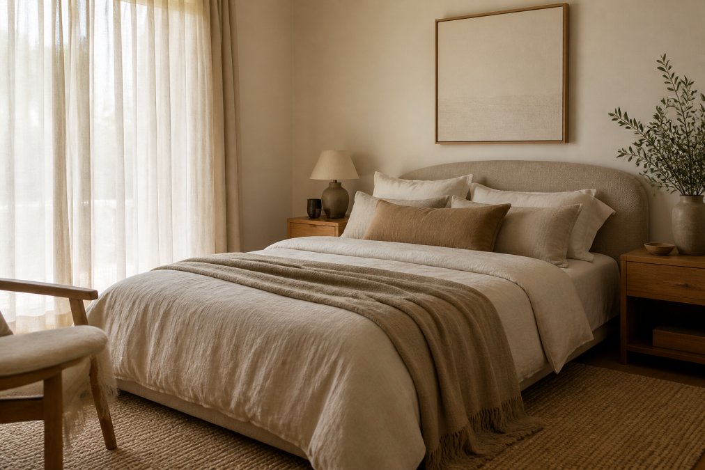
A monochromatic neutral scheme uses varying shades of a single hue: a deep taupe on the wall, mid-tone linen bedding, and an ecru throw. A two-tone scheme pairs a warm neutral with a cooler one for a more dynamic but still serene result. The most common mistake is choosing colours in isolation. Always test a sample on the wall and live with it for 48 hours before committing.
Warm Neutrals vs Cool Undertones: Which Suits Your Space?
Warm neutrals suit rooms with north-facing or west-facing aspects that receive warmer afternoon light, making a space feel grounded and enveloping. Cool undertones work best in rooms that receive strong natural light from the south or east, where warm neutrals can tip into yellow or orange under bright daylight.
The practical test: hold a white piece of paper next to your paint sample. If the sample looks yellow or pink, it is warm. If it looks blue or green, it is cool. Choose the undertone that complements your existing flooring and furniture.
Wall Paint and Wallpaper Ideas for a Neutral Scheme
Wall colour anchors the entire room. For a neutral bedroom, the most versatile choices sit in the mid-range: not stark white (which can feel clinical) and not a deep earthy tone (which can feel heavy).
Popular wall directions for a neutral scheme include:
- Warm white with a yellow or pink undertone, suits timber floors and linen bedding beautifully
- Taupe or greige, the most forgiving neutral, works with almost any soft furnishing palette
- Clay or terracotta-adjacent neutrals, earthy tones that add warmth without committing to a bold colour
- Textured wallpaper in a natural weave, grasscloth or linen-look wallpaper adds texture without introducing colour
Wallpaper is worth serious consideration for a feature wall. A subtle organic texture or soft botanical in muted ecru adds depth that flat paint cannot replicate.
Texture Layering in Interior Design: Adding Depth Without Colour
Texture layering is the practice of combining materials with different surface qualities, matte, rough, smooth, woven, so that a space reads as rich and layered even without colour contrast. In a neutral bedroom, texture is the primary tool for preventing the scheme from feeling flat or sterile.
Think of texture in three layers: architectural (wall finish, ceiling, flooring), furniture (timber grain, upholstered headboard, rattan), and textile (bedding, cushions, window treatments). A well-executed neutral bedroom addresses all three.
Incorporating Natural Materials: Wood, Stone, and Linen
Natural materials are the backbone of any credible neutral bedroom. Timber bedside tables, stone or ceramic lamp bases, woven rattan pendants, and linen bedding all share a quality that synthetic materials cannot replicate: they age well and carry slight tonal variation that adds life to a monochromatic palette.
Timber is the most accessible natural material in the bedroom. Light timbers suit cool neutral palettes, while darker timbers anchor warm neutral schemes. Stone appears most often as a lamp base or decorative object, introducing textural contrast that reads as luxurious. Linen is the textile equivalent, with natural slub and slight irregularity that catches light differently across the day. As documented in sustainable textiles research from RMIT University, natural fibres like linen also regulate temperature more effectively than synthetic alternatives.
Soft Textiles and Bedding: Building a Cosy, Layered Bed
The bed is the focal point of any bedroom, and in a neutral scheme it carries most of the textural weight. Start with a fitted sheet in tight-weave cotton or linen. Add a quilt cover in your primary neutral, then layer a lightweight blanket or coverlet in a contrasting texture. Add cushions, then finish with a throw draped loosely over one corner.
How to Choose Neutral Cushions and Throws for Your Bedroom
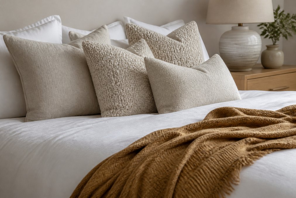
Cushions and throws are where most people either nail or undermine a neutral bedroom. Treat cushion selection as a miniature version of the broader texture layering strategy. Aim for at least three different textures across your cushion arrangement: a smooth linen, a tactile boucle, and something with a slight sheen or embroidered detail. Keep all tones within the same neutral family and vary the scale of the cushions rather than using uniform sizes.
A practical arrangement for a queen bed:
- Two Euro pillowcases (65 x 65 cm) at the back in your primary neutral
- Two standard cushions (50 x 50 cm) in a contrasting texture
- One rectangular lumbar cushion (30 x 60 cm) at the front in a subtle accent tone
For throws, choose a weight and texture that contrasts with your quilt cover. Drape it over the corner of the bed or fold it across the foot, never lay it flat across the entire surface.
Casa Sereno's cushion and throw collections are built around exactly this principle: each piece is designed to work within a neutral palette while contributing a distinct textural quality.
Cushion Position |
Recommended Size |
Texture |
Tone |
|---|---|---|---|
Back row (Euro) |
65 x 65 cm |
Smooth linen or cotton |
Primary neutral (ecru, soft white) |
Mid row (standard) |
50 x 50 cm |
Boucle or chunky weave |
Secondary neutral (warm greige, taupe) |
Front (lumbar) |
30 x 60 cm |
Embroidered or textured |
Subtle accent (camel, clay, stone) |
Lighting Techniques That Complete a Neutral Bedroom
Lighting is the element that makes or breaks a neutral scheme. A beautifully styled neutral bedroom under harsh overhead lighting will look flat and cold. The same room under layered ambient lighting becomes the tranquil oasis the palette promises.
Replace the single overhead source with multiple lower-level points of light. This creates ambient lighting that wraps the room rather than illuminating it from above, which is both more flattering and more conducive to relaxation.
A layered lighting approach for a neutral bedroom includes:
- Bedside lamps, the most important light source. Warm bulbs (2700K-3000K colour temperature) enhance warm neutrals and create a cosy atmosphere
- A floor lamp in a corner, adds depth and fills the room with indirect light
- Pendant lighting, a woven rattan or linen pendant adds a natural material element while diffusing light softly
- Dimmable controls, essential for shifting from task lighting to ambient lighting
According to sleep environment research published by the Sleep Health Foundation, exposure to warm, low-level light in the hour before sleep significantly supports the body's natural melatonin production.
How to Style a Neutral Bedroom on a Budget
A neutral scheme is more forgiving of a mixed budget than a bold colour palette, because coherence comes from tone and texture rather than brand or price point. Identify two or three anchor pieces worth investing in, typically the quilt cover, the cushions, and the throw, and keep everything else simple.
Budget priorities for a neutral bedroom makeover:
- Bedding first, the quilt cover and pillowcases cover the largest visual surface
- One quality throw, a single well-chosen throw adds more warmth and texture than three cheaper ones
- Lighting, replacing a harsh overhead bulb with a warm-toned alternative transforms the room immediately
- Sheer curtains, window treatments filter light beautifully and add softness to the room's perimeter
What you do not need to spend on: matching bedside tables, a new bed frame, or decorative objects. A neutral palette is coherent enough to make mismatched furniture look intentional.
Small Bedroom Neutral Styling Hacks
Small bedrooms benefit from neutral styling more than any other room type. The monochromatic quality reduces visual boundaries, making the space feel larger.
Specific hacks for small rooms:
- Keep the wall and ceiling tone close, drawing the eye upward and increasing perceived height
- Use mirrors strategically, reflecting natural light and doubling apparent depth
- Choose low-profile furniture, reducing visual clutter
- Limit accent pieces, one well-chosen decorative object reads as intentional
- Extend curtains from ceiling to floor, elongating the wall and making the room feel taller
The neutral palette does the heavy lifting in a small room. Texture layering creates all the visual interest the space needs.
Maintaining and Cleaning Neutral Fabrics
Neutral fabrics show marks differently from dark ones. A cream linen cushion will show a coffee splash immediately; a charcoal one will not. This requires a slightly different maintenance approach.
For linen and natural cotton bedding:
- Wash at 40°C on a gentle cycle to preserve the weave structure
- Avoid biological detergents on natural fibres
- Line dry where possible; tumble dry on low if needed
- For spot stains, treat immediately with cold water and gentle detergent
For cushion covers and throws:
- Check care labels, but most quality linen covers can be machine washed on a cool, gentle cycle
- Wool throws should be hand-washed or dry-cleaned
- Store seasonal throws in a breathable cotton bag to prevent moisture build-up and yellowing
Yellowing of white and ecru natural fibres is almost always caused by inadequate rinsing or storage in non-breathable conditions. A monthly wash with white vinegar in the rinse cycle prevents this effectively. As noted in textile care guidance from Choice Australia, natural fibre bedding that is washed correctly and stored properly will outlast synthetic alternatives by a significant margin.
Creating a serene retreat from a bedroom that feels restless is a challenge most homeowners face. A well-executed neutral bedroom does not require a full renovation or a significant budget, it requires the right foundation pieces chosen with intention. Casa Sereno's curated collections of linen bedding, textured cushions, and quality throws are designed specifically for this purpose: each piece selected to layer beautifully within a neutral palette and hold its quality through years of use. Get started with Casa Sereno and transform your bedroom into the calm, considered space it should be.
Frequently Asked Questions
How do you prevent a neutral bedroom from looking flat or boring?
The key is textural contrast. Layer different materials — linen bedding, a boucle throw, a jute rug, and timber or stone accents — so the eye has visual interest to travel across, even within a single colour family. Varying the finish of surfaces (matte walls, a glossy ceramic lamp, a woven cushion) adds the same effect. Subtle accent pieces in camel, clay, or soft sage can introduce just enough warmth without breaking the monochromatic scheme.
What is the best neutral colour palette for a relaxing bedroom?
Warm neutrals tend to feel the most restful in a bedroom. Shades like taupe, beige, ecru, and soft greige sit comfortably together and age well over time. If your room receives strong afternoon light, cooler undertones such as soft grey or pale linen can stop the space from feeling too warm. A monochromatic palette built around one anchor neutral, then layered with two or three tonal variations, consistently produces a calm, cohesive result without requiring colour expertise.
How do you dress up a neutral bedroom without adding colour?
Focus on texture, scale, and organic shapes. Swap flat cushions for ones with ribbing, fringing, or embroidery. Add a chunky knit or waffle-weave throw. Introduce a large-format artwork in black, white, or raw linen tones. Vary the height of bedside accessories — a tall lamp, a low stack of books, a small plant — to create visual rhythm. Window treatments in sheer linen add movement and softness without introducing a competing colour.
What are the essential textures for a neutral bedroom aesthetic?
A well-styled neutral bedroom typically draws from five texture families: woven naturals (linen, cotton, jute), soft pile (boucle, velvet, wool), hard organics (timber, stone, rattan), smooth surfaces (ceramic, glass, lacquered timber), and sheer or lightweight fabrics for window treatments. You don't need all five in every room, but combining at least three creates the layered, tactile quality that stops a neutral palette from reading as flat or unfinished.

