

Table of Contents
- Why Elegant Home Decor for Professionals Goes Beyond Looks
- Luxury Home Office Design Ideas That Support Focus
- Curated Homewares: Building a Collection of Statement Accents
- Adairs Alternatives for Luxury Home Textiles That Last
- High-End Home Styling Tips for Timeless Interiors
- Creating a Sanctuary for Productivity and Rest
- Your Next Step Towards an Elegant, Functional Home
- Frequently Asked Questions
Last Updated: September 8, 2026
Elegant home decor for professionals is about creating a space that supports focus, signals competence, and provides genuine respite after demanding days. At Casa Sereno, we believe a refined home is not about filling rooms with expensive objects, but about selecting fewer, better pieces that bring calm and clarity to your daily routine.
The most sophisticated interiors treat the entire home as one cohesive sanctuary, where the same design principles of texture, light, and restraint carry through every room.
Why Elegant Home Decor for Professionals Goes Beyond Looks
Research in environmental psychology consistently shows that cluttered, visually chaotic spaces increase cortisol levels, while orderly, aesthetically pleasing rooms promote clearer thinking and better emotional regulation (peer-reviewed research). For professionals who spend significant hours working from home, the visual field around you is active input that affects decision quality and stress.
A thoughtfully styled home signals that your space deserves the same care you give your career. This is where elegant home decor becomes a professional tool rather than an indulgence. The goal is not perfection, but coherence.
Luxury Home Office Design Ideas That Support Focus
The best luxury home office design ideas start with ergonomics, not aesthetics. A beautiful chair that causes back pain, or a stunning desk at the wrong height, will undermine your focus within weeks. Invest first in a supportive chair and a desk that allows your elbows to rest at 90 degrees, then build the aesthetic layer around that.
Once the ergonomic core is right, apply the principle of visual quiet. Keep your desk surface clear except for a few purposeful items: a quality task lamp, a ceramic mug, and one sculptural accent. Create one focal point and let everything else recede.
Lighting deserves special attention. Layered lighting, combining ambient overhead light with a dedicated task lamp, reduces eye strain and helps maintain energy through long work sessions. Position your desk perpendicular to windows where possible to avoid screen glare while still capturing natural light, which supports circadian rhythm.
Curated Homewares: Building a Collection of Statement Accents
Curated homewares are the difference between a room that looks furnished and one that looks considered. The goal is to build a collection of accents that speak to each other through material and form, rather than matching sets.
Start with sculptural pieces that anchor a shelf or console. The Decorative Tall Candelabras in quality glass bring an elegant feel home with minimal effort, while the Tall Candelabra Midnight Range in Black offers a bolder, architectural silhouette that pairs well with lighter textures.


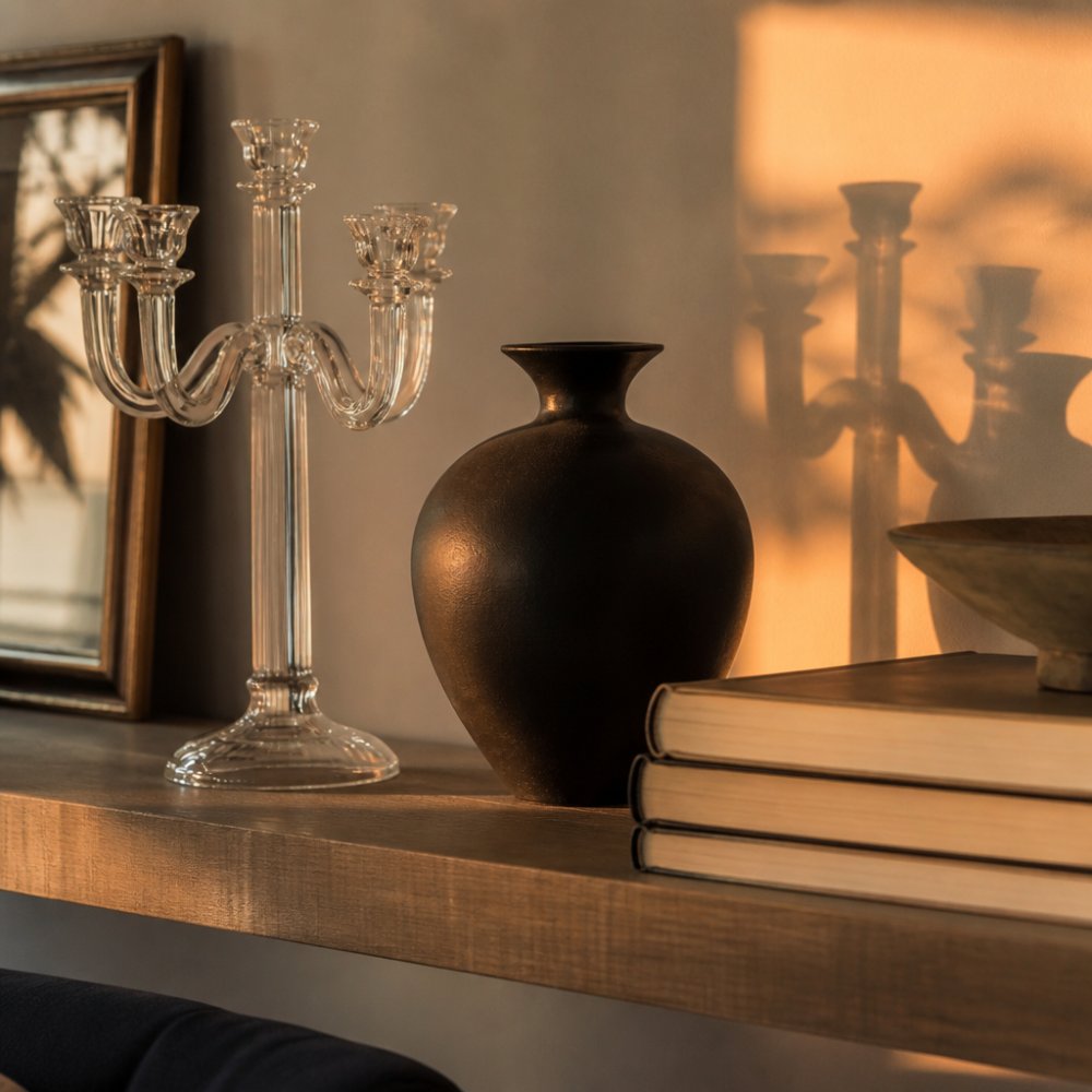
A styled living room shelf in warm neutral tones, featuring a glass candelabra, a black ceramic vase, and a stack of hardcover books under soft evening light
When arranging accents, follow the rule of three: group objects in odd numbers with varying heights. Resist the urge to fill every surface; negative space is what separates a curated collection from a cluttered one.
Adairs Alternatives for Luxury Home Textiles That Last
For professionals seeking alternatives for luxury home textiles, the conversation should begin not with brand names but with the physics of fibre and the chemistry of finishing. Most mainstream retailers sell bedding that degrades within a year of regular use. The differentiator is the fibre staple length, the weave structure, and the absence of chemical treatments.
The Fibre Hierarchy: What Actually Determines Longevity
Cotton is not a single category. Upland cotton has a staple length of roughly 1 to 1.2 inches, which limits how tightly it can be spun (cotton.org). Long-staple varieties such as Egyptian Giza 45 or Supima reach 1.5 inches or more, allowing for finer, stronger yarns that resist pilling and fraying. When a label claims "Egyptian cotton," verify whether it specifies the Giza variety.
European flax, particularly from Normandy or Belgium, produces longer, more uniform fibres than lower-grade Asian flax. A genuine Belgian flax linen quilt cover will feel slightly crisp initially, with visible slubs and irregularities; that is a sign of integrity, not defect.
The Hidden Role of Finishing Chemicals
The buttery-soft hand-feel of premium-priced textiles is frequently the product of silicone softeners and resin finishes applied at the mill. After three to five wash cycles, the coating breaks down, and the fabric reverts to its underlying state. If that state is a loose weave with short fibres, the result is a rough, pilled surface.
The test is simple: rub the fabric vigorously between your fingers for ten seconds. A treated fabric will feel slick or waxy; an untreated natural fibre will generate slight friction and warmth. Hold the fabric up to a light source; a tight percale or sateen weave will show minimal light penetration, while a loose weave will reveal a visible grid.
Construction Details That Predict Five-Year Performance
Beyond fibre, examine three structural elements:
- Seam allowance: Quality quilt covers use a 2-centimetre or deeper French seam or flat-felled seam. This prevents fraying and maintains structural integrity through repeated laundering. Cheap covers often use a single-fold hem of less than 1 centimetre that unravels within months.
- Button or zip closure: Mother-of-pearl buttons or concealed YKK zippers indicate a manufacturer investing in hardware. Plastic buttons and exposed metal zippers are cost-cutting signals.
- Weave density: Thread count is a notoriously manipulated metric; some mills count multiple plies to inflate the number. A more reliable indicator is fabric weight per square metre. A quality cotton sateen should weigh approximately 120-140 grams per square metre; a substantial linen should be 160-200 GSM (textileexchange.org). If the weight is not listed, request it or move on.
The Cost-Per-Wear Argument for Professionals
For a professional who values time as much as money, the economics favour investment. A premium linen quilt cover priced at $400 that lasts eight years yields a cost per wear of roughly $0.14 per night. A $120 synthetic-blend alternative that degrades after eighteen months costs $0.22 per night and delivers inferior thermal regulation and skin comfort. The arithmetic favours quality, but only with correct care: wash in cold water on a gentle cycle and avoid bleach-based detergents.
The Sustainability Angle Competitors Ignore
The textile industry is among the largest contributors to microplastic pollution; synthetic blends shed thousands of fibres per wash that enter waterways. Natural fibres such as linen and organic cotton biodegrade, and European flax cultivation typically requires significantly less water than cotton. Look for OEKO-TEX Standard 100 certification, which verifies the absence of harmful substances, and GOTS certification for organic fibre integrity.
High-End Home Styling Tips for Timeless Interiors
High-end home styling tips consistently return to one principle: restraint. But restraint alone is not a strategy; it is an outcome. The mechanism behind timeless interiors is better understood through the psychology of visual processing and the mathematics of spatial proportion.
The 60-30-10 Rule Applied to Professional Interiors
The most reliable formula for a cohesive, enduring palette is the 60-30-10 distribution. Sixty percent of the visual field should be a dominant neutral, walls, large upholstery, and floor coverings in tones of ivory, warm greige, or soft oatmeal. Thirty percent should be a secondary tone that adds warmth without competing, deeper taupe, mushroom, or a muted olive. Ten percent is reserved for accent, a single metallic finish, a deep terracotta, or a navy that appears in small objects only.
This ratio works because it mirrors the natural distribution of colour in landscapes, which the human brain processes as inherently calm and ordered. When the accent colour exceeds roughly 15 percent of the visual field, cognitive load increases measurably. Professionals who spend hours in video conferences should pay particular attention: a busy background is a distraction for your audience and a subtle drain on your own focus.
The Psychology of Texture Layering
Texture is not decoration; it is sensory information. The brain processes tactile qualities through visual cues alone, a phenomenon called visual-tactile cross-modal perception. A room that presents three or more distinct textures provides richer sensory input than a monotextural space, which the brain reads as sterile or unfinished.
For small spaces, texture layering is the single most effective tool for creating depth without adding objects. A chunky cable-knit throw over a smooth linen sofa, a ribbed ceramic vase beside a polished glass carafe – these pairings draw the eye across the room, making the space feel larger and more considered.
Proportion and Negative Space in Compact Interiors
The most common styling error in apartment-sized professional homes is overscaling. A 2-metre sofa in a 3-metre living room creates a space that feels cramped regardless of how beautiful the individual pieces are. Maintain at least 60 centimetres of walkway clearance and leave approximately 40 percent of any surface visibly empty.
Negative space functions as visual punctuation. It tells the eye where to stop and allows the objects you do display to register as intentional. On a bookshelf, group books in small stacks, leave gaps between groupings, and limit decorative objects to one per shelf section.
The Small-Space Professional Styling System
Most styling guides assume a dedicated home office with generous square footage. The reality for many professionals is a combined living-dining-working area. The elegant solution is not to hide the workspace but to integrate it through consistent material language.
Choose a desk and shelving in the same timber tone as your dining or coffee table. Use the same ceramic or glass accent family across both zones. When the workday ends, a simple ritual – closing a laptop or sliding a shoji screen across the workspace – signals the transition from professional to personal mode.
Materials That Age with Dignity
Finally, consider the lifecycle of materials. Marble, solid timber, and ceramic develop patina, micro-scratches, subtle colour shifts, and surface character that add narrative depth. In contrast, engineered surfaces such as high-gloss laminates show wear as degradation, not character. For an interior that still feels current in 2035, choose materials that will look better after a decade of daily life.
Creating a Sanctuary for Productivity and Rest
The concept of a sanctuary acknowledges that your home must serve two opposing needs: intense focus and deep relaxation. Elegant home decor for professionals bridges this divide by using consistent design language across work and rest zones.
In practice, this means extending the same material palette from your office area into your bedroom and living spaces. If your workspace features warm wood and ceramic accents, carry those into the bedroom through a timber bedside table and a ceramic lamp base. This visual continuity signals that the entire home is a cohesive, calm environment.
The bedroom itself deserves particular attention as the site of recovery. Invest in bedding that feels genuinely luxurious against the skin, as sleep quality directly affects professional performance. A well-made quilt cover in natural fibres, paired with a textured throw at the foot of the bed, creates an inviting retreat that supports the rest your body requires.
Your Next Step Towards an Elegant, Functional Home
Achieving elegant home decor for professionals does not require a complete renovation or a massive budget. It requires a shift in approach: buying fewer, better pieces, prioritising natural materials, and allowing negative space to do its work. Start with one room, identify the single focal point, and build outward from there.
Casa Sereno offers a curated selection of luxury home decor, elegant bedding, and unique accessories designed to help you create this balance. From sophisticated quilt covers and refined tableware to decorative cushions and statement candelabras, every piece in our collection is chosen for timeless style and lasting quality. New subscribers receive 20% off their first order, and shipping is free on orders over $200.
Frequently Asked Questions
How can professionals balance functionality and elegance in home decor?
Choose pieces that serve a purpose while adding visual interest. A glass candelabra on a desk tray keeps essentials organised and acts as a sculptural focal point. In living areas, use storage baskets in natural fibres to hide clutter. Select furniture with clean lines and durable fabrics. This approach keeps your space practical for daily life without sacrificing the refined, elegant home decor feel you want after work hours.
How do you choose high-quality home textiles that last?
Look at the fibre content first. High-quality linen and long-staple cotton feel substantial and improve with washing. Check the thread count for cotton sheets; 400 to 600 is a good range. Examine the stitching on quilt covers and cushion inserts. Quality pieces use reinforced seams and natural materials that hold up, unlike fast-fashion textiles that pill or fade after a few washes.
What is the 3-5-7 rule in decorating?
The 3-5-7 rule is a styling guideline for creating visually balanced groupings. Odd numbers feel more natural and dynamic than even ones. For shelves or console tables, group three items of varying heights, or arrange five smaller objects together. This creates a focal point without looking cluttered. Apply this to your elegant home decor by mixing a tall candelabra with smaller ceramic or glass pieces.
How can neutral colour palettes make a home look more expensive?
Neutral palettes create a calm, cohesive backdrop that lets texture and form stand out. When you use shades of white, beige, stone and soft grey, the eye reads the space as intentional and sophisticated. The secret is layering different textures within those neutrals, such as a chunky knit throw against smooth linen bedding or a matte ceramic vase next to polished glass. This approach feels timeless and high-end.

