
Table of Contents
- Why Neutral Bedroom Paint Colours Create a Calmer Space
- Warm vs Cool Neutral Paint Colours: Which Undertone Suits Your Bedroom?
- How to Test Paint Samples on Bedroom Walls Before You Commit
- Choosing the Right Paint Finish for Bedroom Walls
- Matching Neutral Paint to Your Bedroom Lighting
- Styling the Best Neutral Bedroom Wall Paint Colours with Bedding and Decor
- Conclusion
- Frequently Asked Questions
Last Updated: September 30, 2026
Why Neutral Bedroom Paint Colours Create a Calmer Space
The best neutral bedroom wall paint colours sit low on saturation and high on light reflection, so they read as calm rather than flat. Neutral bedroom paint works because it removes visual noise, and a bedroom is where your eyes need rest, not stimulation.
Warm vs Cool Neutral Paint Colours: Which Undertone Suits Your Bedroom?
Undertone decides everything. Warm neutrals lean yellow, red or brown. Cool neutrals lean blue, green or violet. Get this wrong and no amount of styling will fix it.
Warm Neutrals: Beige, Greige and Earthy Browns
Warm neutrals suit bedrooms with limited natural light, particularly south-facing rooms that never quite warm up. Beige brings softness. Earthy browns add depth without heaviness. Greige sits between grey and beige, which makes it the safest choice if you cannot decide.
Cool Neutrals: Grey, Off-White and Taupe
Cool greys and taupe work best in bright, north-facing rooms where strong light would otherwise make a warm wall look yellow. Off-white is the most versatile, reflecting light without reading as stark.
| Undertone | Best Light | Pairs With | Watch Out For |
|---|---|---|---|
| Warm beige | Low natural light | Warm white trim, timber | Yellow cast in bright sun |
| Greige | Any | Almost everything | Can read flat without texture |
| Cool grey | Bright, north-facing | Cool white, silver | Cold and clinical in dim rooms |
| Taupe | Moderate light | Linen, stone, brass | Can look muddy under warm bulbs |
| Off-white | Any | Everything | Shows marks easily |
How to Test Paint Samples on Bedroom Walls Before You Commit
Testing paint samples on bedroom walls is not optional, and a swatch card will not do it. Paint a 30cm square directly on the wall, in at least two spots, and live with it for three days.
A few things that trip people up:
- Paint dries darker than the wet sample. Judge it dry, never wet.
- Apply two coats. One coat over an existing colour tells you nothing.
- Paint on white card and move it around the room if you cannot commit to the wall.
- Check the sample against your bedding and furniture, not against the shop shelf.
Choosing the Right Paint Finish for Bedroom Walls
The right paint finish for bedroom walls is matte or low-sheen eggshell. Matte hides imperfections and gives the softest look; eggshell adds durability and wipes clean more easily. Finish also changes how the colour reads, how the wall wears, and what you can safely clean it with.
How finish changes the colour
Sheen level affects how much light the wall reflects, changing the apparent depth of the colour:
- Matte absorbs more light, so the colour reads deeper and richer. A greige that looks soft on a swatch can look almost brown in matte.
- Eggshell reflects a little more light, so the colour reads slightly lighter and cleaner.
- Satin reflects noticeably more, which can wash out a subtle neutral and make it look flat.
Durability and maintenance trade-offs
Neutral walls show scuffs, marks and handprints more readily than saturated colours, because there is no colour variation to hide them, making finish a maintenance decision as much as an aesthetic one:
| Finish | Sheen Level | Best For | Durability | Cleaning |
|---|---|---|---|---|
| Matte | Lowest | Low-traffic bedrooms, imperfect walls | Lower, marks show and can be hard to remove | Gentle wipe only; scrubbing can burnish the surface |
| Eggshell | Low | Most bedrooms, easy cleaning | Good, resists light scuffs | Damp cloth with mild soap |
| Satin | Medium | Kids' rooms, high-touch areas | High, stands up to repeated cleaning | Wipeable without dulling |
| Semi-gloss | High | Trim and doors only | Highest | Wipeable, but too reflective for walls |
Low-VOC and low-odour options
Bedrooms are enclosed spaces where you sleep, so paint fumes matter more here than in a hallway. In Australia, look for paints labelled low-VOC (volatile organic compounds) or no-VOC. Most major brands offer low-VOC lines in their neutral ranges, typically water-based, so they dry faster and smell less.
The finish rule that matters most
Match the finish to the traffic, not the trend. A low-traffic adult bedroom can carry matte beautifully; a kids' room or a room with a pet needs eggshell or satin. Whatever you choose, buy a small tin and test it on the wall in that finish before committing to the whole room, the colour you loved in matte may not be the colour you get in eggshell.
Matching Neutral Paint to Your Bedroom Lighting
Lighting-specific colour matching is where most people get it wrong, and it is the biggest gap in the advice available online. The same neutral paint can look three different colours in three rooms, purely because of the light, so treat this as the decision point, not an afterthought.
Damask Universal Bedspread Set - White →
Start with the room's orientation
In the southern hemisphere, the sun tracks across the northern sky, so your windows' compass direction sets the baseline colour of the daylight entering the room:
- North-facing rooms receive consistent, cool, indirect light all day. There is little direct sun, so the light leans blue-grey. This cool light will push any neutral cooler and can make a warm beige look grey or slightly green. Choose a warmer neutral, a beige with a yellow or red base, to counteract it.
- South-facing rooms receive strong direct sun for much of the day. The light is warm and can be intense, which pushes neutrals yellow and can make a cool grey look almost cream. Choose a cooler neutral, a grey or taupe with a blue or green base, to balance it.
- East-facing rooms get bright, warm morning light that fades to cooler, flatter light by afternoon. The colour will read warmer in the morning and cooler later, so pick a neutral that sits close to the middle, a true greige rather than a strong beige or a strong grey.
- West-facing rooms get cool morning light and warm, golden afternoon light. The afternoon warmth is the dominant impression, so a slightly cooler neutral stops the room reading orange by 4pm.
Then account for the artificial light
Artificial light has a colour temperature measured in kelvin (K), and it shifts paint as much as daylight does:
- Warm white (around 2700K) is the standard for bedrooms. It leans yellow-orange and will warm any neutral, sometimes turning a cool grey slightly green.
- Cool white (around 4000K) leans blue-white and will cool any neutral, sometimes making a warm beige look chalky.
- Daylight (around 5000-6500K) is very blue and is best avoided in a bedroom, it makes most neutrals look clinical and can disrupt the wind-down feel you are trying to create.
Reflected light and surface area
Light does not just arrive from the window and the bulb. It bounces off every surface in the room, and those surfaces tint it:
- Pale floors, white bedding and light curtains bounce light back and make the walls read lighter and cooler than the swatch suggests.
- Dark timber furniture, heavy curtains and dark rugs absorb light, so the walls read deeper and warmer.
- A room with a large mirror or glossy surfaces will bounce more light and exaggerate the wall's undertone.
A quick decision shortcut
If you want a single rule for the paint shop: look at your room at the time of day you use it most. Cool light, go warmer. Warm light, go cooler. Dramatic changes, go neutral-middle. That one question resolves more colour failures than any swatch card.
Styling the Best Neutral Bedroom Wall Paint Colours with Bedding and Decor
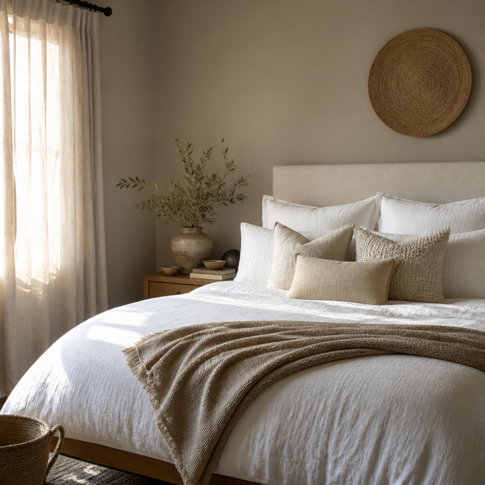
A few styling principles that hold up:
- Keep bedding in one family and let texture do the work
- Add one timber or brass element for warmth
- Use a bed skirt to hide the gap under the bed and finish the look cleanly
- Avoid adding a second neutral that fights the wall's undertone
Conclusion
The best neutral bedroom wall paint colours suit your light, not a mood board. Test on the wall, in the finish you will use, at three times of day, that process tells you more than any swatch card.
Frequently Asked Questions
What is the most relaxing neutral paint colour for a bedroom?
Warm neutrals like greige, soft beige and muted taupe tend to feel the most restful because they sit between warm and cool without pulling strongly in either direction. They reflect ambient light gently, which softens shadows and helps the room feel calm rather than stark. If your bedroom gets limited natural light, a warm off-white or light greige will keep the space feeling open and inviting without the chill that cool greys can introduce in low light.
How do I choose the right neutral paint for a bedroom with low light?
Low-light bedrooms benefit from neutrals with a warm undertone and a higher light reflection value. Cool greys and blue-based whites can turn dull and shadowy when natural light is scarce, so lean toward warm off-whites, soft beiges or greige. Test your shortlist on the wall you see most often and check it at three times of day: morning, afternoon and evening under artificial light. The shade that stays consistent across all three is the one to commit to.
Do neutral walls make a bedroom look bigger?
Neutral walls can make a bedroom feel larger when the shade is close to the ceiling colour and the trim, because the eye reads the room as one continuous surface rather than several broken planes. Light neutrals with a high light reflection value bounce ambient light around the space, which adds to that sense of openness. Pairing them with a cohesive palette across walls, bedding and curtains reinforces the effect without needing to knock down a wall.
Should I choose a cool or warm neutral for my bedroom walls?
It depends on your fixed elements: flooring, furniture timber and the direction your window faces. North-facing rooms receive cooler, indirect light, so warm neutrals like beige or greige balance that. South-facing rooms get warmer light, so cool greys and off-whites keep things from feeling too golden. If you have warm timber floors, a warm neutral will feel cohesive; with grey or white floors, a cool neutral sits more naturally.
How do I pair neutral wall colours with bedroom decor and bedding?
Layer texture rather than colour. A warm greige wall works beautifully with white cotton bedding, a textured coverlet and a soft throw in a slightly deeper tone. The Damask Universal Bedspread Set in white is a good example: the white keeps the palette light while the cotton texture stops the room feeling flat against a neutral wall. Add one deeper accent, such as an earthy brown cushion or a taupe throw, to ground the scheme without breaking the calm.