

Table of Contents
- Why Mixing Textures Changes How a Room Feels
- The Rule of Three: A Simple Starting Point for Texture
- Balancing Smooth and Rough Textures in One Space
- How to Mix Patterns in Decor Without the Clash
- How to Style Cushions and Throws Like a Pro
- Texture by Room: Where to Focus Your Efforts
-
Common Mistakes to Avoid When Mixing Textures
- Mistake 1: Ignoring Maintenance Requirements Before You Buy
- Mistake 2: Combining Textures with Conflicting Cleaning Methods
- Mistake 3: Forgetting That Texture Traps Dust and Allergens
- Mistake 4: Ignoring the Durability of the Underlying Surface
- Mistake 5: Choosing Textures That Fight the Room's Function
- Your Next Step: Start with One Corner
- Frequently Asked Questions
Last Updated: September 4, 2026
Texture is the quiet workhorse of interior design, yet it is the element most often overlooked in favour of colour and layout. Mixing textures combines different surface qualities, smooth velvet, rough linen, organic wood, to create depth and warmth that flat colour alone cannot achieve.
Why Mixing Textures Changes How a Room Feels
Amonochromatic palette can look flat without contrast in surface finishes. Texture provides the missing dimension, engaging the tactile sense and giving a space that layered, collected-over-time quality.
A room filled with hard surfaces like timber floors, glass tables, and leather sofas can feel cold. Introducing plush cushions and woven throws signals comfort, which is why bedrooms and living areas benefit most from a considered approach to materiality.
The Rule of Three: A Simple Starting Point for Texture
Limit yourself to three distinct surface qualities within any single vignette or zone, preventing the chaos of too many competing materials.
A classic living room corner might pair a smooth ceramic vase with a chunky knit throw and a rustic timber side table. Each material occupies a different point on the spectrum from refined to organic.
Start with one dominant texture, such as a velvet sofa, then select two supporting textures that differ in weight and finish. A linen cushion introduces a relaxed, matte contrast, while a leather ottoman adds a smooth, cool surface.
Balancing Smooth and Rough Textures in One Space
Opposition creates interest, and nowhere is that clearer than in pairing smooth and rough surfaces. The glossy finish of a ceramic lamp base makes the raw, nubby character of a linen weave or jute rug feel intentional.
Pairing Velvet with Linen for Contrast
Velvet and linen sit at opposite ends of the texture spectrum. Velvet is plush and reflects light softly; linen is crisp with a visible slub. Together, they create a dialogue between luxury and ease.
On a bed or sofa, a velvet cushion in a deep jewel tone alongside a natural linen cushion in a neutral shade gives the eye two distinct surfaces to compare. The Pearl Zena Cushion Prefilled - Linen at $69.00 offers that relaxed, textured base, while the Velvet Cushion Feather Filled - Blue at $79.00 supplies the plush counterpart.


Using Natural Materials to Bridge the Gap
Natural materials such as timber, rattan, wool, and stone act as neutral bridges between very different textures. Their organic, imperfect surfaces help smooth and rough elements coexist.
A timber coffee table grounds a seating arrangement, while a wool rug softens the floor beneath it. When unsure whether two textures will work, introduce a natural element between them.
How to Mix Patterns in Decor Without the Clash
Pattern is simply another form of visual texture. The same principles of contrast and balance apply, with one additional consideration: scale.
Sticking to a Cohesive Colour Palette
A cohesive colour palette is the safety net that allows bold pattern mixing to succeed. When every pattern shares a common colour family, the eye reads the composition as harmonious.
Choose two or three colours that already exist in your room, and ensure every patterned piece pulls from that limited range. You can then pair a large floral with a geometric stripe and trust they will coordinate.
Varying Pattern Scale for Visual Interest
The golden rule of pattern mixing is to vary the scale. Pair a large-scale motif with a medium print and a small, dense pattern, and the eye moves with ease. Two patterns of identical scale cause that clashing, restless feeling.
A bold, oversized leaf print on a throw can sit comfortably beside a fine pinstripe or small polka dot on cushions. The contrast in scale creates hierarchy.
How to Style Cushions and Throws Like a Pro
Cushions and throws are the fastest, most affordable way to experiment with texture, and they are the pieces you can swap seasonally to refresh a room.
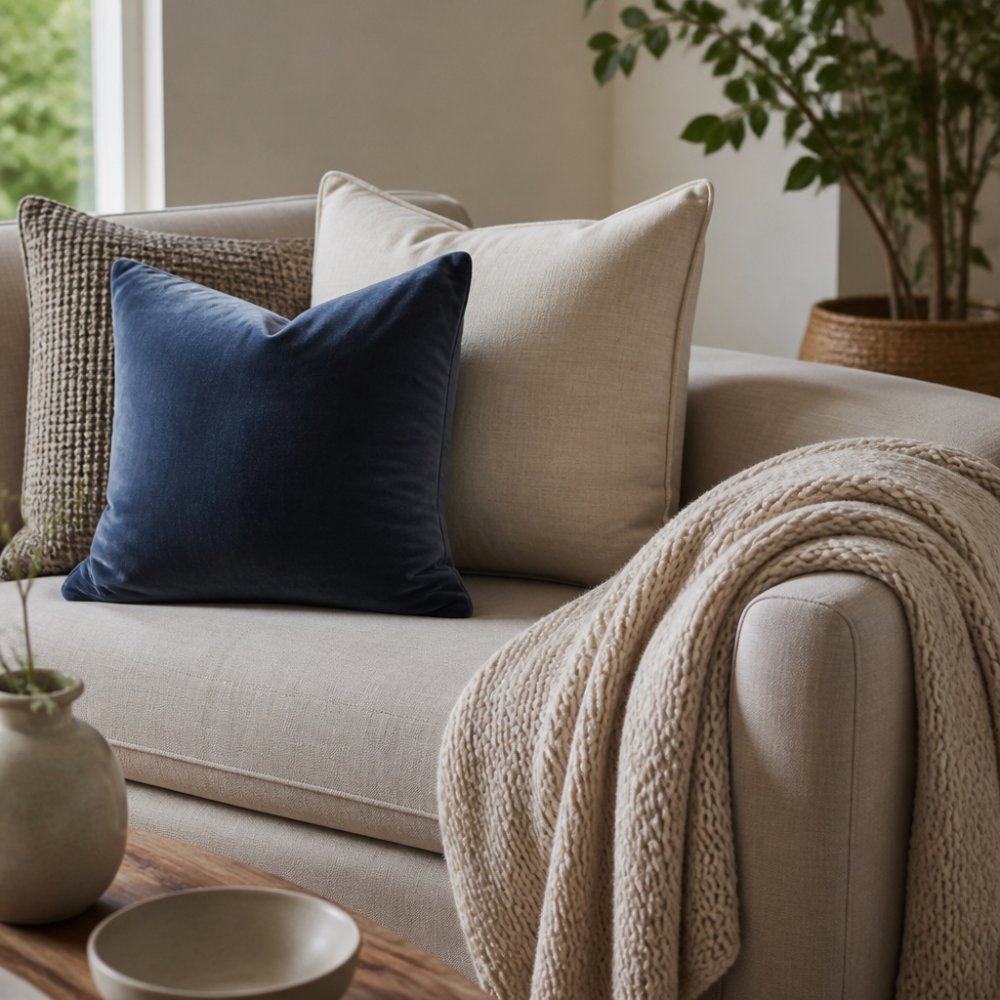
A styled neutral-toned living room sofa in soft natural light, layered with a plush velvet blue cushion, a smooth linen cushion in cream, and a chunky knit throw draped casually over the armrest
Layering Different Sizes and Shapes
Start with larger cushions at the back and work forward with smaller pieces. Varying dimensions, pairing a 45cm square with a 30cm square or a lumbar shape, adds depth and a more curated look.
Choosing the Right Fill for the Right Look
The fill determines whether a cushion looks structured and crisp or soft and inviting. Feather-filled cushions offer a plush, sink-in feel, while fibre-filled options hold their shape and look tailored. The Embroidered Suede Cushion at $75.00 shows how a structured fill can anchor an arrangement.

Embroidered Suede Cushion
Texture by Room: Where to Focus Your Efforts
Adapt your texture strategy to the function, traffic, and existing finishes of each space.
Living Room: Anchor with the Sofa, Then Build Outward
The sofa is the largest upholstered surface, so its texture sets the room's baseline. A smooth linen sofa reads casual; a plush velvet sofa reads formal. Once that baseline is set, you need contrast in the accessories.
- For a linen or cotton sofa: Add a velvet cushion (like the Velvet Cushion Feather Filled - Blue at $79.00) to introduce a soft, light-reflecting surface, and a chunky knit throw for a rough, tactile element.
- For a velvet or boucle sofa: The surface is already plush, so you need to dial back the softness. Use smooth leather cushions, a flat-weave wool throw, or a crisp cotton lumbar to create contrast without overwhelming the eye.
Don't forget the floor. A jute or sisal rug under a velvet sofa creates a deliberate rough-smooth dialogue. In a high-traffic family room, choose a flat-weave wool rug over a deep shag pile, it adds texture but is easier to vacuum.
Bedroom: Prioritise the Tactile Layer You Feel Most
The bedroom is the one room where texture is experienced directly against the skin, so start with the bedding, not the cushions.
- Sheets: Linen sheets (200-300 gsm) offer a breathable, relaxed feel that softens with every wash (peer-reviewed research). Percale cotton is crisper and cooler in summer. Flannelette is a winter-only option. Choose one base texture and build from there.
- Quilt cover and throw: A quilt cover in a smooth cotton sateen contrasts well with a chunky wool or cable-knit throw folded at the foot of the bed. This gives you the smooth-rough pairing without adding layers you have to remove every night.
- Cushions: In a bedroom, cushions are purely decorative. Limit them to two or three so the bed doesn't become a chore to dismantle each evening. A velvet lumbar paired with a linen square is enough.
A common mistake is treating the bedroom like a showroom. If you actually sleep there, every texture must be practical to maintain. Silk cushions spot-clean poorly; a washable linen or cotton cushion is a smarter choice.
Kitchen and Dining: Texture You Can Wipe Down
Kitchens and dining areas are high-traffic, high-spill zones. The strategy here is about surfaces that add warmth without compromising hygiene.
- Dining chairs: Upholstered chairs in velvet or boucle look stunning but absorb spills and food odours. A performance velvet with a stain-resistant finish is a better option, or choose leather or faux leather for a smooth, wipeable surface that still adds warmth (furnituretoday.com).
- Tableware and runners: This is where you can experiment cheaply. A stoneware dinner set with a matte, speckled glaze adds visual texture against a smooth timber table. A linen table runner introduces a soft, natural fibre that is machine-washable.
- Rugs: If you have a rug under the dining table, choose a low-pile or flat-weave wool. High-pile rugs trap crumbs and are difficult to clean. A flat-weave kilim or a textured sisal with a smooth border is both practical and visually interesting.
Bathroom and Entryway: One Statement Piece Is Enough
These are transitional spaces where a single textural statement can carry the room. Over-accessorising quickly feels cluttered.
- Bathroom: A plush, high-quality bath mat in a thick cotton or bamboo fibre adds softness underfoot against tiles. A textured ceramic vessel sink or a natural timber stool introduces an organic element. Avoid mixing more than two textures here, the room is usually small, and the finishes (tiles, mirrors, chrome) already provide plenty of smooth surfaces.
- Entryway: A textured bench or stool in rattan or timber sets the tone immediately. Add a woven basket for storage, it is both functional and textural. A smooth ceramic catch-all for keys provides the contrast.
Minimalist Bedrooms and Busy Kitchens: The Edge Cases
Texture is most critical in rooms where other elements are stripped back or already busy.
- In a minimalist bedroom (white walls, simple furniture), texture is the only tool you have to prevent the room from feeling sterile. Layer a wool rug, linen bedding, and a single velvet cushion. The rule of three works perfectly here because there is no pattern or colour doing the heavy lifting.
- In a busy kitchen (patterned tiles, lots of appliances), texture should be restrained. Choose one textural element, a natural timber cutting board on display, a woven runner, or a matte stoneware set, and let everything else recede. Too many competing textures in an already busy room creates visual noise.
By tailoring your texture choices to each room's function and traffic, you avoid the trap of a one-size-fits-all formula. A velvet cushion that works on a living room sofa may be wrong for a dining chair.
Common Mistakes to Avoid When Mixing Textures
The usual advice, don't overdo it, watch the scale, don't forget the floor, is sound but incomplete. The mistakes that actually derail a scheme show up six months later, when the velvet has piled and the silk cushion has a stain.
Mistake 1: Ignoring Maintenance Requirements Before You Buy
Velvet, jute, silk, wool, and linen all have different care requirements, and mixing them without considering maintenance creates a living nightmare.
- Velvet (especially cotton or viscose velvet) crushes under pressure. Placing a velvet cushion where someone sits every day will flatten the pile permanently. Reserve velvet for decorative cushions or low-traffic areas, or choose a performance velvet with a stain-resistant finish that is more durable.
- Jute and sisal are beautiful but brittle. They shed, they stain easily, and they cannot handle moisture. A jute rug under a dining table or in an entryway will show every spill and scuff. Use them in low-traffic areas, or choose a wool-blend rug that mimics the texture without the fragility.
- Silk is the most delicate of all. It fades in direct sunlight and stains permanently with water. A silk cushion on a sofa near a window is a recipe for disappointment. If you love the sheen, choose a silk-blend or a high-quality faux silk that offers the look without the maintenance burden.
- Linen wrinkles and creases, that is part of its charm, but it also means it needs ironing or steaming if you want a crisp look. A relaxed, lived-in aesthetic forgives this; a formal one does not.
Before you commit, ask yourself: how will I clean this? If the answer involves dry cleaning or specialist products for more than one piece, you are creating a maintenance burden you will resent.
Mistake 2: Combining Textures with Conflicting Cleaning Methods
Even if each texture is beautiful, mixing materials that require different cleaning approaches creates friction. A wool rug needs professional cleaning; a jute rug cannot be wet-cleaned. A velvet cushion is spot-clean only; a linen cushion is machine-washable.
Group textures by care level. In a family living room, choose machine-washable textures for everything that touches the floor or gets handled daily. Reserve delicate pieces for purely decorative areas.
Mistake 3: Forgetting That Texture Traps Dust and Allergens
Textured surfaces are dust magnets. Boucle, shag pile, and heavy wool weaves trap dust, pet hair, and allergens far more effectively than smooth surfaces (aaaai.org). In a bedroom or a home with allergy sufferers, this is a genuine health consideration.
- Choose low-pile or flat-weave rugs over shag pile.
- Vacuum textured upholstery weekly with an upholstery attachment.
- Wash cushion covers regularly, check the care label before buying.
- In a bedroom, avoid heavy velvet curtains that collect dust; opt for linen or cotton blends that are machine-washable.
Mistake 4: Ignoring the Durability of the Underlying Surface
Texture is not just about the top layer. The surface beneath your rug or the finish on your furniture affects how textures age. A rough, unsealed timber floor under a jute rug will wear unevenly.
Consider the base surface first. If your floors are highly polished, you need more soft, matte textures to balance the glare. If your floors are rough-hewn timber, smooth surfaces will stand out more.
Mistake 5: Choosing Textures That Fight the Room's Function
A dining chair upholstered in white boucle looks stunning in a showroom but will not survive a household with children. A silk quilt cover is impractical if you share the bed with a pet. Texture must serve the room's function, not just its aesthetic.
Before you finalise a scheme, run a mental simulation of a typical week in that room. If the texture combination cannot survive spills, pets, and daily wear, it is the wrong combination for that space.
By addressing maintenance and durability upfront, you can mix textures with confidence, knowing your scheme will look as good in twelve months as it does on day one.
Your Next Step: Start with One Corner
You do not need to redesign an entire room to see the effect of texture. Pick one corner, one sofa, or one bed, and apply the rule of three with a smooth piece, a rough piece, and a natural material.
The principles are simple to learn but take practice to master, and the reward is a home that feels layered, personal, and inviting. At Casa Sereno, our curated collections of velvet, linen, and natural fibre pieces are designed to work together.
As you build your scheme, remember that the goal is not perfection but a space that reflects how you want to live.
The challenge of creating a warm, personal home comes down to mastering the subtle art of surface contrast. Casa Sereno exists to make that process effortless, with carefully curated cushions and throws in velvet, linen, and natural fibres designed to layer beautifully together. Explore the collection and discover how the right mix of textures can transform your house into a sanctuary, with free shipping on orders over $150 and 20% off your first order when you join our list.
Frequently Asked Questions
What is the rule of three in decorating?
The rule of three is a styling principle suggesting that objects grouped in odd numbers, specifically three, create a more balanced and visually appealing composition than even numbers. In texture mixing, this means combining three distinct surfaces, like a smooth velvet cushion, a rough woven throw, and a sleek leather sofa. Odd numbers prevent the eye from pairing items and encourage it to move around the space. Start with a base of three textures in one area, then build from there.
How do I mix patterns and textures without clashing?
The secret is to keep a common thread. Start by selecting a cohesive colour palette; choose patterns that share at least one colour. Then, vary the scale of your patterns, pairing a large floral with a small geometric print. When mixing textures, ensure you balance smooth and rough surfaces. For example, place a plush velvet cushion against a rough linen sofa. The contrast creates interest without feeling chaotic.
How can I add texture to a neutral living space?
A neutral palette is the perfect canvas for texture. Introduce tactile elements through soft furnishings like cushions and throws. Layer a chunky knit throw over a smooth linen sofa and add cushions in different materials, such as velvet, silk, or cotton. Consider natural materials like a jute rug or a wooden coffee table to add roughness. These pieces create depth and dimension without needing bold colours.
What makes a home look cheap?
A home often looks cheap when there is no contrast or depth, leaving the space feeling flat. This happens when every surface has the same finish, like all-matte paint and low-pile carpet. Mixing textures is an effective way to add a high-end feel. Introduce a mix of plush, smooth, and rough surfaces to create visual weight and interest. Also, avoid overly matched furniture sets, which can feel generic rather than curated.

